
Animated Header Menu
Description: Animated Header Menu is more than just a menu, but a modern website header template with a mobile optimized drop down menu and search form built in, plus room for a logo on the left. The drop down menu transforms into a full screen accordion menu on small screen devices, while the rest of the header also responds in kind to tailor its UI to the smaller real estate on small screen devices. The result is a polished animated header template with the most important UI components built in, ready to be used on your site!
Directions
Step 1: Add the below code to the HEAD section of your page:
This script uses the following external files. Download them below (right click, and select "Save As"):
- ddanimatedheader.js
- ddanimatedheader.css
- Fontawesome and jQuery (CDN hosted, no need to download)
Step 2: Then, add the below markup for the Animated Header and initialization code right after the opening <BODY> tag.
This sets up the stock Animated Header and Menu you see on the demo page. Read on for details on customizing it.
Animated Header behaviour- fixed or unfixed, animated or not?
One of the very first things you may want to tweak is the
behaviour of the header itself. By default, it's fixed at the very top
of the page using CSS's position:fixed, with some top
margin added to the BODY of the page to push down the rest of the page's
content so it's not obscured by the floating header. This is all done
inside ddanimatedheader.css:
body {
/* body top margin so body content isnt' obscured by header */
	margin-top: 90px;
}

/* Fixed header */
#ddfixedheader {
	position: fixed;
	display: flex;
	"
"
Depending on the height of your header, you may need to adjust the BODY top margin accordingly to fully accommodate it from the default 90px value.
If you don't wish the header to be fixed at the top of the
page, change the value "fixed" to "relative" in the
following two places in the CSS:
/* Fixed header */
#ddfixedheader {
	position: relative;
	display: flex;
	"
}

/* Fixed header when user begins to scroll down */
html.collapseheader #ddfixedheader {
	position: relative;
	"
}
Also, by default the header animates whenever the user scrolls
from the very top of the page, by "shrinking" the header. The script
conditionally adds a CSS class of "collapseheader" to the document
root (html) element whenever that happens, which the CSS targets to reduce the
size of header (padding) and the logo inside it. To disable this animation
completely, remove the following code from
ddanimatedheader.css:
/* Fixed header when user begins to scroll down */
html.collapseheader #ddfixedheader {
	position: fixed;
	border-bottom-width: 0;
	border-bottom-color: white;
	box-shadow: 0 2px 2px #eee;
	opacity: .9;
}

/* Logo area when user begins to scroll down */
html.collapseheader #ddfixedheader #logoarea {
	width: 170px;
}

html.collapseheader #ddfixedheader #logo img {
	width: 170px;
}
Customizing the drop down menu
The top drop down menu (which transforms into an accordion
menu on small screen devices) is defined inside the markup simply as a
regular UL element with a class of "ddmainulmenu":
<ul id="ddmainulmenu">
	<li><a href="http://www.google.com">Item 1</a></li>
	<li><a href="#">Folder 1</a>
		<ul>
		<li><a href="http://www.google.com">Sub Item 1.1</a></li>
		<li><a href="http://www.google.com">Sub Item 1.2</a></li>
		</ul>
	<li>
	<li><a href="http://www.google.com">Item 2</a></li>
</ul>
Please note that currently the menu only supports one level of nested menu.
The style of the drop down menu are affected by the selectors
inside
ddanimatedheader.css targeting "ddmainulmenu". For
example, the following selector renders the arrows beneath the top level menu
items carrying a drop down menu:
#ddfixedheader ul#ddmainulmenu li > a:after {
	/* Arrow beneath top level LI links */
	content: "";
	position: absolute;
	"
}
Customizing the Mobile Accordion Menu
The Top Drop Down Menu automatically transforms into a
full page Accordion Menu when the browser screen size is sufficiently
small. The Accordion Menu is actually a duplicate of the Drop Down Menu
in terms of its markup, contained inside the dynamically added DIV "ddmobilemenucontainer".
Here's a portion of the relevant selectors inside
ddanimatedheader.css that style the
accordion container and the UL menu itself:
/* ########## Shared style for mobilemenucontainer and ddsearchcontainer DIVs ########## */
div#ddmobilemenucontainer, div#ddsearchcontainer {
	position: fixed;
	width: 100%;
	"
}

/* ########## Accordion Menu main UL style ########## */

div#ddmobilemenucontainer ul {
	list-style: none;
	margin: 0;
	padding: 0;
	width: 350px;
	position: relative;
	margin: 0 auto;
}
Each header inside the accordion- or LI element containing a
sub UL menu - is dynamically given a class of "header" to its A
child element. The currently opened accordion header is also assigned a class of
"active" on top of that. Here's a diagram of the dynamically added
classes inside the accordion UL:
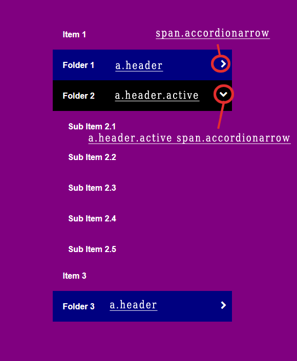
As you can see from above, the arrow inside each header link is
rendered using a SPAN with class "accordionarrow", which is also
dynamically added by the script. Inside
ddanimatedheader.js, the full markup for
the arrow can be customized in the following line:
var accordionheaderarrow = '<span class="accordionarrow"><i class="fa fa-chevron-right" aria-hidden="true"></i></span>'
The above markup displays a right arrow icon from Fontawesome- modify it as desired.
Configuring the mobile settings breakpoint
The header becomes mobile optimized at a specific screen dimension, by default 860px or lower in width. This number can be changed by updating it in the following two places:
1) Inside ddanimatedheader.css:
@media (max-width: 860px) {
#ddfixedheader ul#ddmainulmenu {
	display: none;
}

div.uneven-hamburger-icon {
	display: flex;
	margin-left: auto;
}
}
2) And inside ddanimatedheader.js:
var mql = window.matchMedia("screen and (max-width: 860px)")
At that point or lower, the Animated Header hides the top menu and displays the hamburger icon toggler to toggle the mobile Accordion Menu. If the Accordion Menu is visible when you screen becomes wider than the mobile breakpoint, the menu is then hidden.